
Case Study
Ten Bends Beer
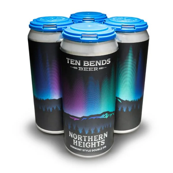
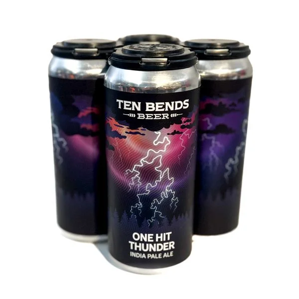
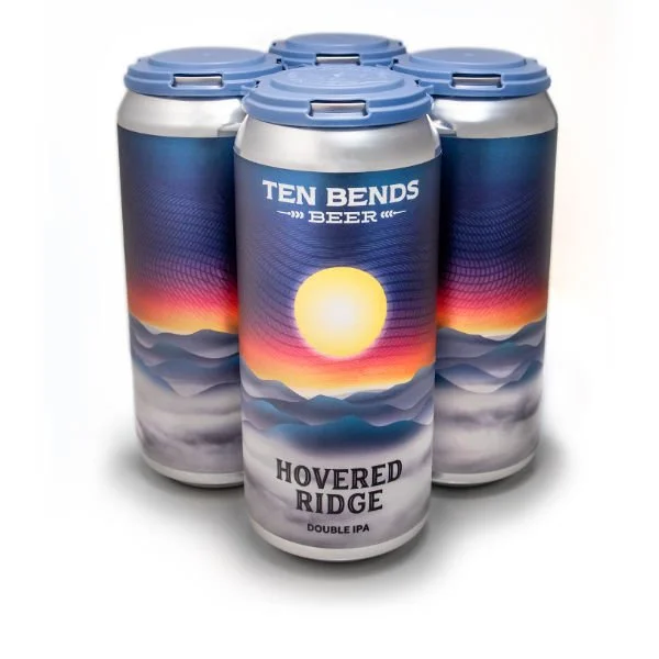
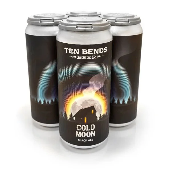
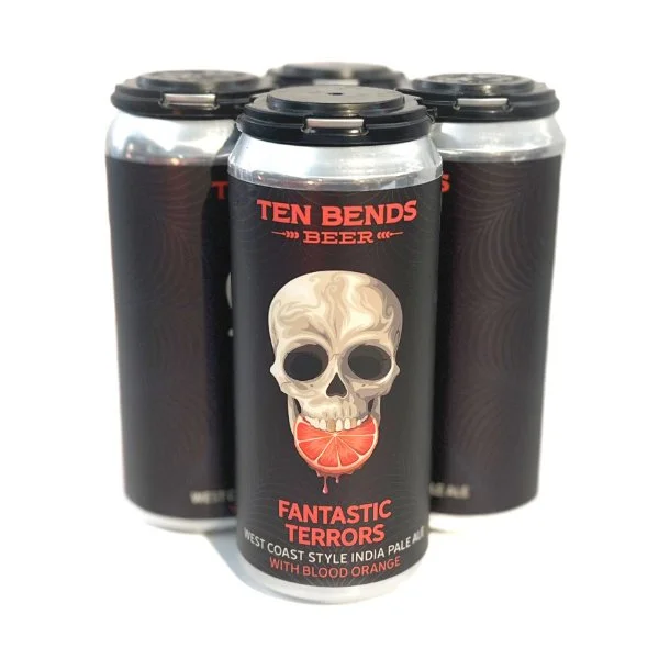
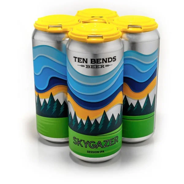
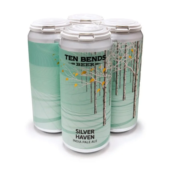
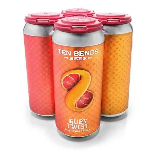
Packaging as a System, Not a Series of Labels
Role: Founder, Brand Director, Packaging System Designer
Responsibilities: System Design, Creative Direction, Collaboration, Production Oversight
Scope: 25+ beer labels
Format: Cans & packaged goods
Overview
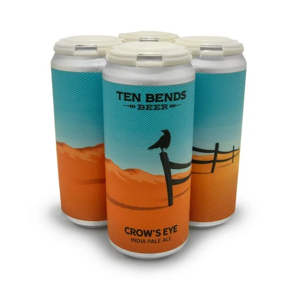
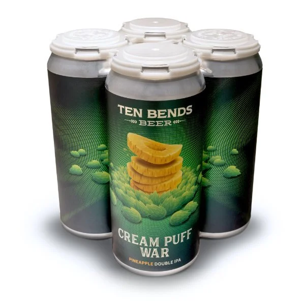
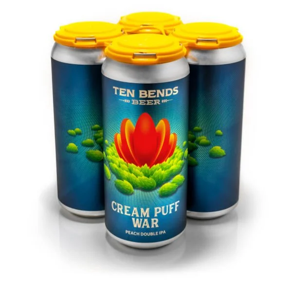
At Ten Bends Beer, packaging has always been treated as a core part of the brand experience—not an afterthought or a rotating canvas for trends. With a growing portfolio of beers and seasonal releases, the challenge was to create a packaging system that could scale creatively without diluting recognition or coherence.
I led the development of Ten Bends’ packaging framework and directed every label design from initial concept through final production. While individual illustrations were created by a hired artist, I defined the system, layout logic, hierarchy, and constraints that ensured consistency across more than two dozen unique labels.
The Challenge
Craft beer packaging often rewards novelty, but novelty at scale can quickly erode brand clarity. With an expanding lineup of beers—each with its own name, style, and personality—the risk was fragmentation: labels that looked individually interesting but collectively incoherent.
The goal was not to create a single “look,” but a repeatable structure that could support variety while preserving immediate brand recognition on shelf.
The Strategic Approach
Rather than treating each label as a standalone design, I approached packaging as a system.
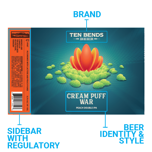
The framework established clear, consistent rules for:
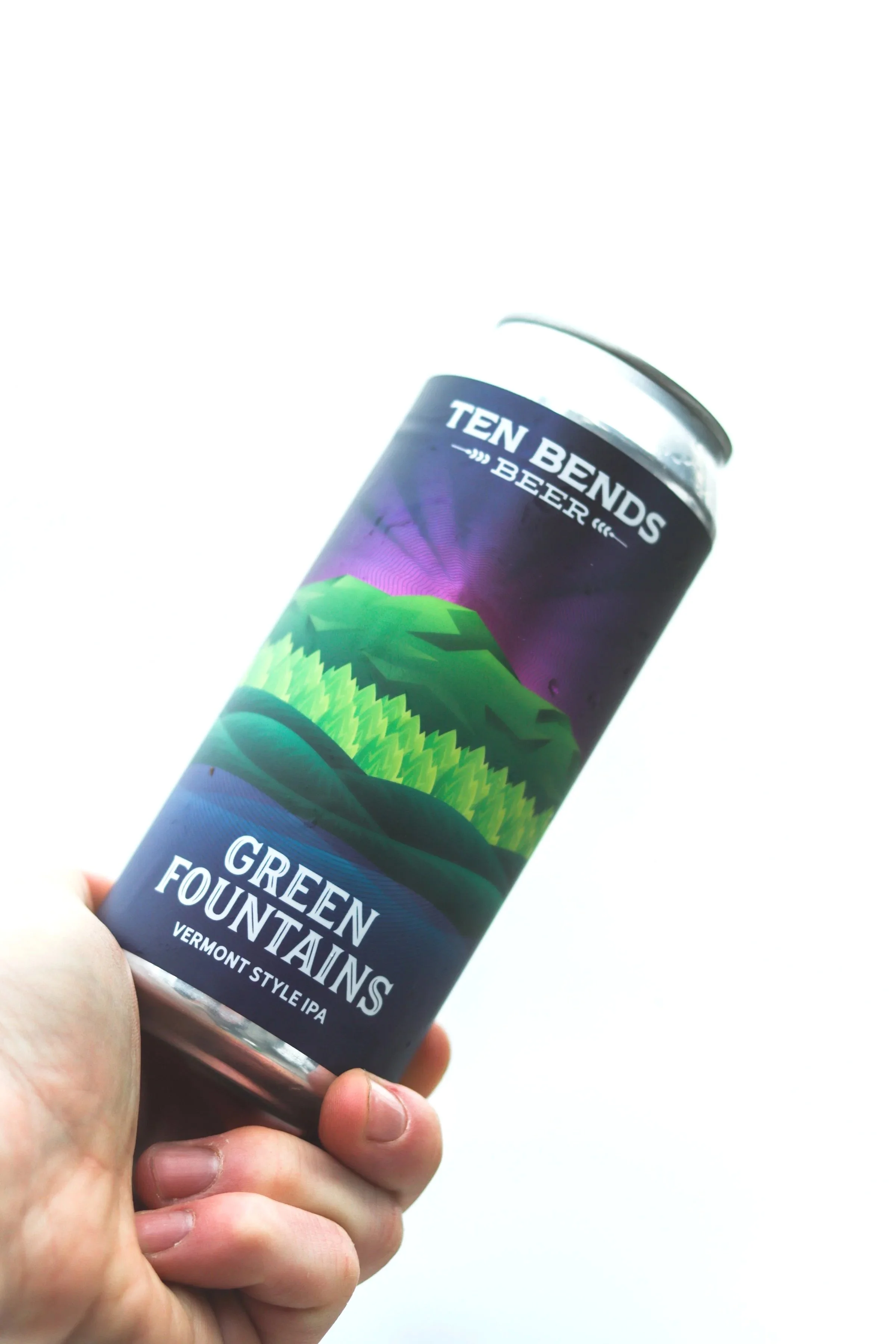
Brand placement and hierarchy
Beer name prominence
Style designation and product details
Supporting information grouped into a structured sidebar
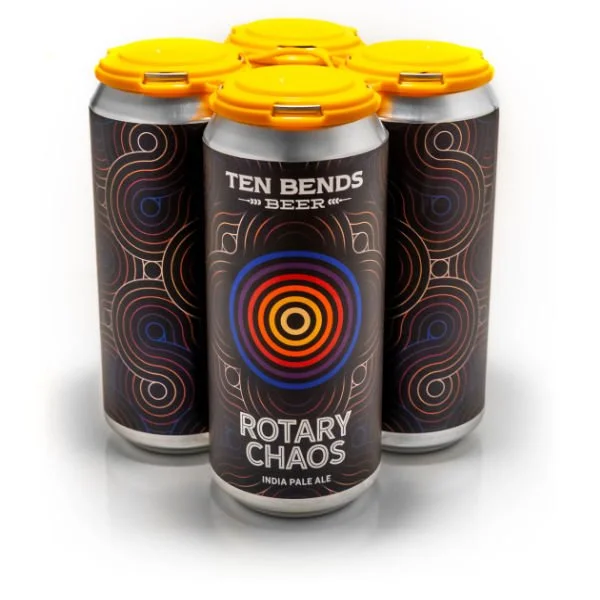
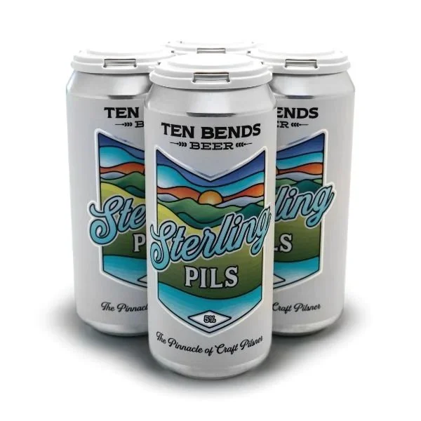
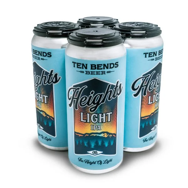
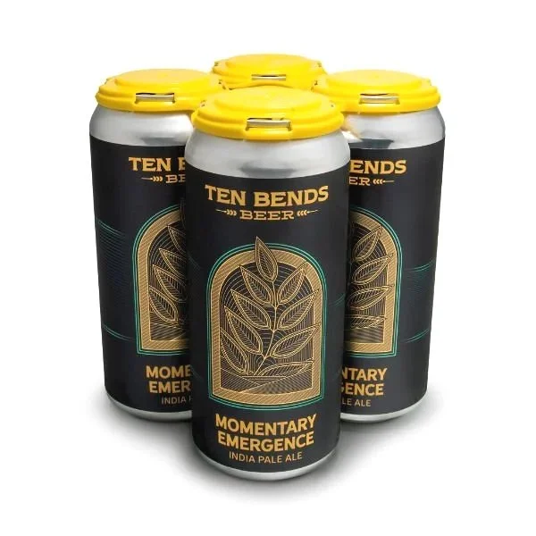
This sidebar became a defining element of the system—housing functional information in a predictable location so the illustrated portion of the label could remain expressive without compromising clarity or usability.
By separating structure from illustration, the system allowed creative range while maintaining discipline.
“The goal was not to create a single ‘look,’ but a repeatable structure that could support variety while preserving immediate brand recognition on shelf.”
Creative Direction & Collaboration
Although I did not create the illustrations themselves, I led every label from start to finish.
My role included:
Developing early layout concepts and structural rules
Collaborating closely with the illustrator during initial sketches
Guiding revisions to ensure alignment with brand tone and hierarchy
Balancing expressiveness with legibility and shelf impact
Overseeing final production and print readiness
Each label followed the same underlying framework, but no two labels felt identical. This balance was intentional: familiarity without repetition, creativity without chaos.
Execution at Scale
Over time, the system was applied across more than two dozen beers—core offerings, seasonals, and limited releases. Because the framework was established early, new labels could be developed efficiently without sacrificing quality or cohesion.
The consistency of placement and hierarchy meant:
Customers could quickly identify Ten Bends on shelf
Staff could explain products more easily
New releases felt like part of a family, not experiments
Design decisions were tested repeatedly in the real world—on shelves, in coolers, and in customers’ hands—reinforcing the importance of clarity and restraint.
Results & Impact
The packaging system has allowed Ten Bends to expand its product lineup while maintaining a strong, recognizable identity. Despite wide variation in illustration style and beer personality, the brand remains immediately identifiable. More importantly, the system has proven durable. It continues to support new releases without requiring reinvention, demonstrating that thoughtful structure can be a creative enabler rather than a limitation.
Reflection
This work reinforced a belief that has guided much of my career: the strongest design systems don’t call attention to themselves—they create space for others to do great work within them.
By focusing on hierarchy, repetition, and clarity, the Ten Bends packaging system has remained flexible, scalable, and true to the brand—one label at a time.