
Case Study
New England Federal Credit Union
Building a Scalable Digital Brand System Across a Complex Customer Journey
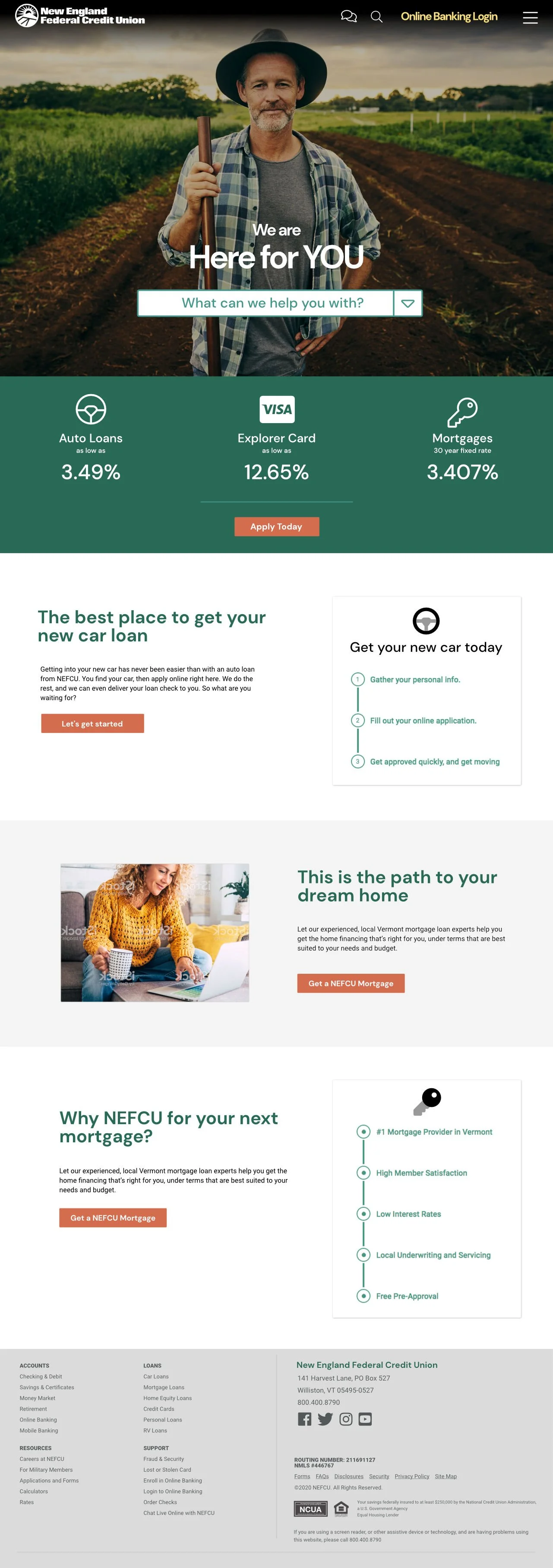
Project Mockups
Select below to view mockups as a click-through presentation. Click each screen to advance to the next. This set shows desktop, mobile, menus, personalization, banking login, and content strategies.
Web Style Guide
Select below to view the style guide developed to set forth all branding and style implementation on the website. This is a one-screen presentation with multiple content types.
Role: Design Director
Responsibilities: UI/UX, Information Architecture, Front-End Development, Third-Party Integration, Client Strategy
Platform: Custom CMS with third-party vendor integrations
Timeline: Multi-year client engagement
Overview
New England Federal Credit Union partnered with Level 9 over many years to evolve its digital presence alongside changing member expectations, branding standards, and technology platforms. During my tenure, I contributed to six successive generations of the websites, culminating in a large-scale redesign focused on personalization, third-party integrations, and long-term scalability.
I served as Design Director on this final iteration, leading user interface design, contributing to information architecture and navigation strategy, collaborating directly with client leadership, and executing front-end HTML and CSS for integration with a custom CMS and multiple external platforms.
Context & Challenge
As a regulated financial institution with a broad and growing service offering, NEFCU’s website needed to balance trust, clarity, and sophistication across a very large content footprint. Visual styles aged quickly, mobile expectations continued to rise, and new branding standards and technologies regularly needed to be incorporated.
Each redesign cycle typically occurred every two to three years, driven not by failure of the previous site, but by the pace of change in digital standards, member behavior, and competitive pressure within the regional financial landscape.
By the time of this project, the challenge extended beyond aesthetics. The site needed to support advanced personalization, integrate multiple third-party platforms, and remain navigable and cohesive at scale — without compromising brand integrity or usability.
The Strategic Need
This redesign was driven by a convergence of goals:
Integrating a personalization platform capable of presenting content dynamically based on user behavior, navigation patterns, and preferences
Modernizing the visual language and interaction patterns across desktop and mobile
Seamlessly incorporating third-party systems including online banking, loan applications, appointment scheduling tools, and other vendor-driven services
Positioning the credit union as a digitally sophisticated, competitive regional institution
A key pressure point was scale. The size and complexity of the site required architectural and navigation decisions that could perform equally well across devices, content types, and entry points.
Execution & Delivery
The project shipped as a fully responsive, large-scale website with complete brand integration across all primary user experiences. Deliverables included:
A modular system of page templates and sub-templates
A tightly integrated custom content management system
A personalization layer capable of delivering tailored content
Branded integrations across multiple third-party platforms
A comprehensive brand style guide used as an ongoing reference
Special attention was given to navigation design, which proved to be one of the strongest aspects of the final solution. The navigation system successfully supported a large and diverse content structure while remaining clear, efficient, and usable across devices.
Results & Impact
The redesign was well received by both internal stakeholders and users, with particular strength in usability, navigation clarity, and overall brand cohesion. The site supported a wide range of functional and content requirements while remaining approachable and intuitive for members.
The architectural and design system proved durable, holding up effectively for three to four years without the need for significant structural changes. Its eventual replacement occurred due to an organizational shift rather than limitations in the system itself.
System Reuse Across Brands
Following the launch of the primary site, much of the underlying structure, component logic, and design methodology was reused to support a sister credit union brand. This enabled the creation of a scaled-down experience with a distinct brand presentation while preserving usability, performance, and technical consistency — demonstrating the flexibility and longevity of the original system.
Reflection
This project reflects a long-term approach to digital design: building systems that can evolve, scale, and adapt over time. Rather than optimizing for a single launch moment, the focus was on creating a resilient foundation that balanced brand, usability, and technical realities within a complex organizational environment.