
Case Study
Granite State Credit Union
Elevating a Digital Presence Through Expressive Brand Integration
This site is still in production at https://www.gscu.org/
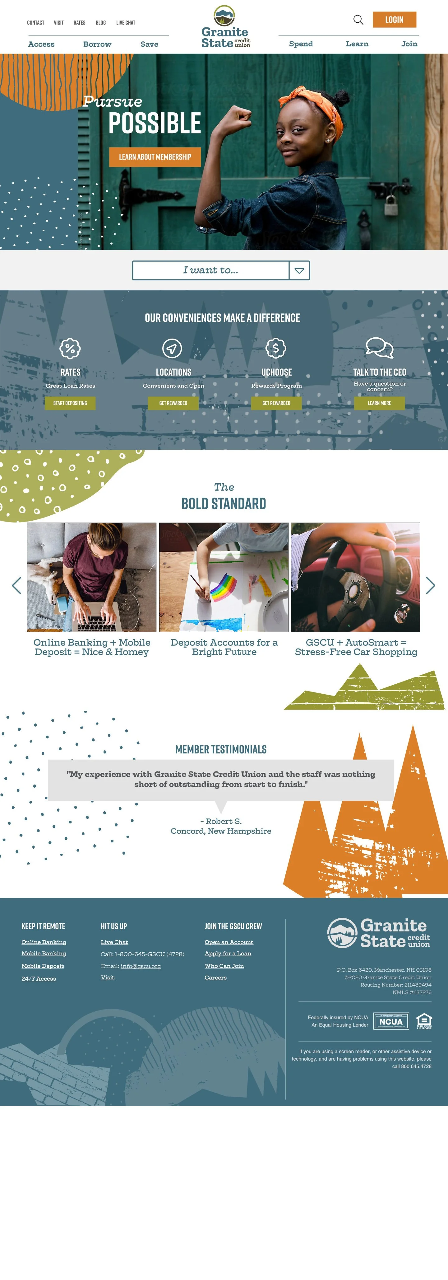
Project Mockups
Select below to view mockups as a click-through presentation. Click each screen to advance to the next. This set shows desktop, menus, banking login, and content strategies.
Web Style Guide
Select below to view the style guide developed to set forth all branding and style implementation on the website. This is a one-screen presentation with multiple content types.
Role: Design Director
Responsibilities: UI Design, Brand Integration, UX Strategy, Front-End Collaboration
Timeline: 2020
Platform: Existing custom CMS framework
Overview
Granite State Credit Union partnered with Level 9 to update its digital presence following the introduction of a refreshed brand system. Although the organization had recently launched a new website, the visual language no longer reflected the credit union’s evolving identity. The goal of this project was to elevate the experience through thoughtful brand integration while preserving the existing technical foundation.
I served as Design Director on this effort, working hands-on across interface design, visual integration, and front-end execution. The project moved on a faster timeline than many large financial institution redesigns, requiring efficiency, restraint, and clear decision-making.
Context & Challenge
Prior to this redesign, Granite State Credit Union had a recently launched website built with its previous branding. While the platform was technically sound, the design lagged behind a newly introduced brand system that emphasized expressive visual elements, including updated colors, background patterns, and imagery.
Because the site had been built so recently, the primary constraint was efficiency. The client wanted to integrate the new brand in a way that felt intentional and elevated, without the cost or disruption of rebuilding the site from scratch. The challenge was to transform the experience visually while leveraging the strong technical foundation already in place.
The Strategic Need
Success for this project was defined by strong brand integration and an elevated digital presence that reinforced the credit union’s credibility and online capabilities. The refreshed brand introduced playful, whimsical elements that needed to be translated to the web in a way that felt confident and polished rather than decorative or excessive.
Usability and mobile compatibility were foundational requirements, consistent with all work produced at Level 9. The site also needed to retain the majority of its existing content, requiring a careful balance between visual transformation and structural continuity.
Strategy & Leadership
I owned interface design and integration across the site, ensuring the new brand was tightly woven into the experience rather than applied superficially. This included making deliberate decisions about how and where brand elements—such as color, pattern, and imagery—were introduced, and which content types were best suited for more expressive treatment.
I worked closely with the internal team throughout the architectural and mockup process, aligning visual decisions with usability and content structure. Given the project’s scope and timeline, it was critical to be selective and intentional, using brand elements in ways that enhanced clarity rather than competing with it.
Based on established trust with the client, I operated with a high level of autonomy, guiding key decisions around visual hierarchy, interface behavior, and overall presentation.
Results & Impact
The redesigned site successfully aligned Granite State Credit Union’s digital presence with its refreshed brand, delivering a more confident and engaging experience for users. The updated interface legitimized the organization’s online capabilities and brought consistency between marketing, brand expression, and functional web experiences.
By building on the existing technical foundation, the project achieved its goals efficiently, demonstrating how thoughtful design leadership can deliver meaningful impact without unnecessary complexity.
Execution & Delivery
The project shipped as a refreshed, fully responsive website that integrated the new brand system seamlessly across desktop and mobile experiences. The existing technical framework was preserved, allowing the team to focus effort on visual refinement and interface quality rather than rebuilding foundational components.
Brand elements such as color and background patterns were applied strategically across page types to create moments of personality while maintaining usability and readability. The result was a cohesive, elevated experience that felt distinctly aligned with the updated brand without compromising performance or accessibility.
Reflection
This project highlights the value of restraint and focus in design. Rather than starting over, the work centered on translating brand intent into a digital experience that felt intentional, usable, and credible — proving that meaningful improvement does not always require reinvention.